Hatcher Brand Refresh
Skills
Branding & Logo design
Art Direction & Design
Awards
The logo is a featured winner in Logo Lounge book 13
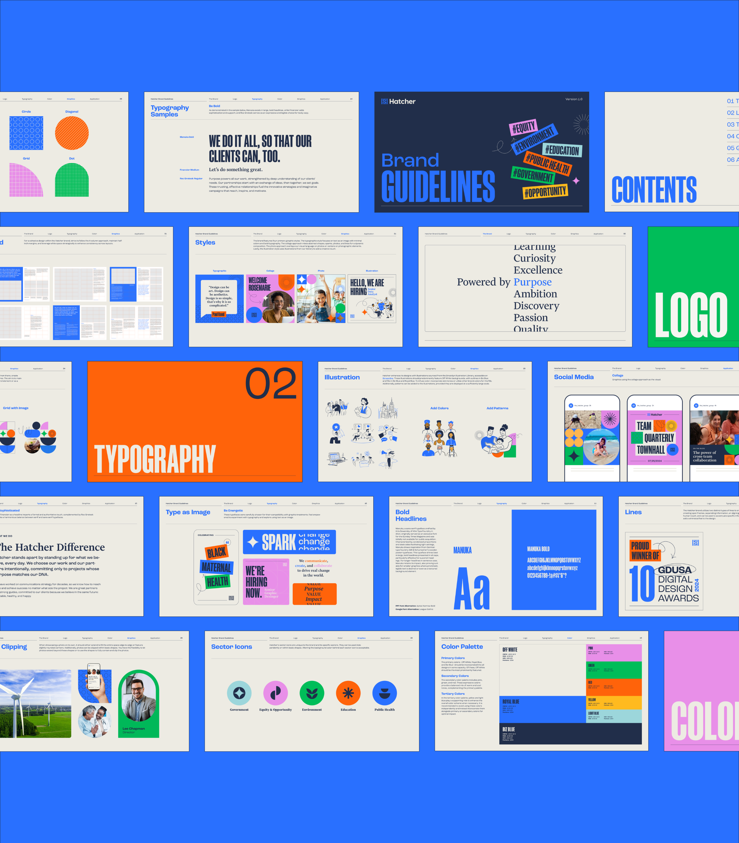
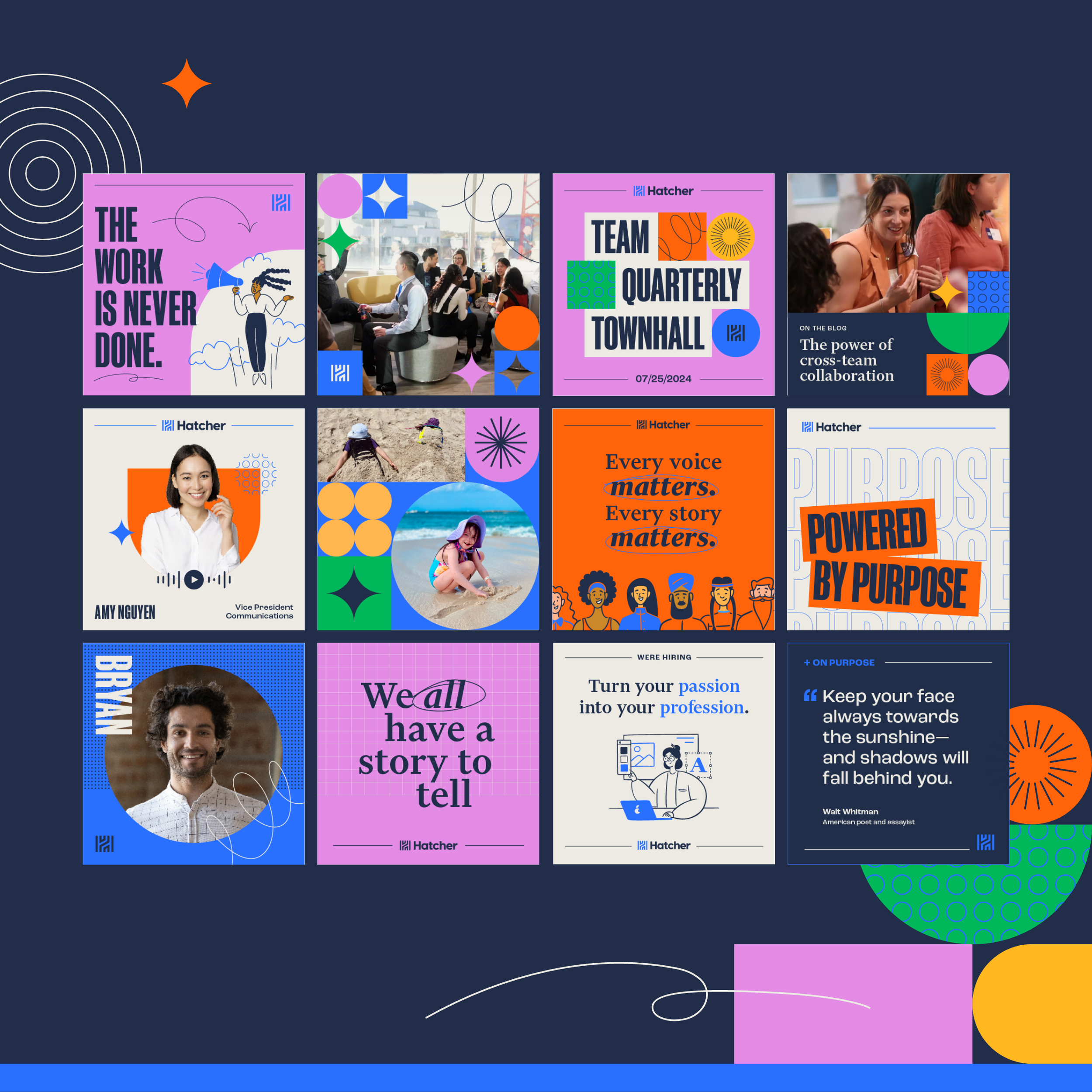
For The Hatcher Group’s brand refresh, I aimed to honor the company’s legacy while bringing its identity into a more modern and dynamic space. I retained the core dark blue and bright blue—subtlely refined for a polished look—while introducing a bold, expansive color palette that reflects the diversity of our work across five key sectors. This vibrant shift not only infused new energy into the brand but also created a more flexible and expressive visual system.
To enhance character and adaptability, I embraced three new typefaces, adding depth and personality to our communications. I also reimagined familiar graphic elements, evolving them into playful, funky, and engaging shapes that better represent Hatcher’s creativity and impact. The result is a refreshed brand that feels fresh, relevant, and distinctly Hatcher—balancing our rich history with a forward-thinking, modern aesthetic.
Creative Direction: Reece Quiñones


